

Overview
- Most personal injury lawyer website design projects fail because the firm bought a look instead of a conversion path, and then nobody measured the difference.
- Your phone number treatment, the proof above the fold, and the length of your intake form move more signed cases than any font or color decision.
- Case results convert well, but every state bar attaches a disclaimer requirement to them, so build the layout around the disclaimer instead of bolting it on after launch.
- Set up CallRail, form tracking, and a Google Search Console baseline before the new site goes live, or you will never know whether the rebuild helped or hurt.
Your redesign is finished, the site looks better than every competitor in your county, and intake is down. That’s the normal outcome of a personal injury lawyer website design project, and the reason is boring: the firm bought a look, and a look is not a conversion path. A visitor who just got rear-ended on the way home from work is not admiring your typography. They’re scanning for a phone number, some evidence you’ve handled their exact situation, and a reason to trust you in about eight seconds.
We’ve already written the general version of this. If you want the fundamentals of structure, page hierarchy, and platform choice, read our guide to law firm website design, and if you want to see real firms doing it well, we pulled apart 32 examples here. This post covers only the PI-specific decisions, the ones that change whether the phone rings.
Treat the phone number as a design element, not a detail
PI is a phone business. Your best cases call, they don’t fill out forms at 11pm. So the number gets the treatment a hero image usually gets.
On mobile, put a tap-to-call button in a sticky bar that never scrolls away. Write the actual number in it. “Contact us” converts worse than seven digits a person can read out loud to their spouse. Repeat the number at the end of every major section, not just the header and footer, because visitors call from wherever they stopped reading.
Use CallRail dynamic number insertion so you can see which channel produced the call, and keep your Google Business Profile number as the primary number in your footer and schema markup so your NAP stays consistent. Firms break their local rankings every year by letting an agency swap a tracking number into every citation. Don’t.
Above the fold, proof beats promises
“We fight for you” is what every PI site in America says, which means it says nothing. The space at the top of your homepage should carry something a competitor can’t copy in an afternoon.
Specific proof that works: the number of cases your firm has tried to verdict, board certification in civil trial law if you have it, years the named partner has practiced in that county, and your live Google review count with the star rating. A real photo of the actual lawyers, taken in your actual office, beats a stock photo of a gavel every time. Visitors are trying to work out if you’re a real firm or a lead broker with a landing page, and stock photography answers that the wrong way.
Skip the hero video. It looks expensive and it costs you Largest Contentful Paint.
Case results, and the disclaimer they require
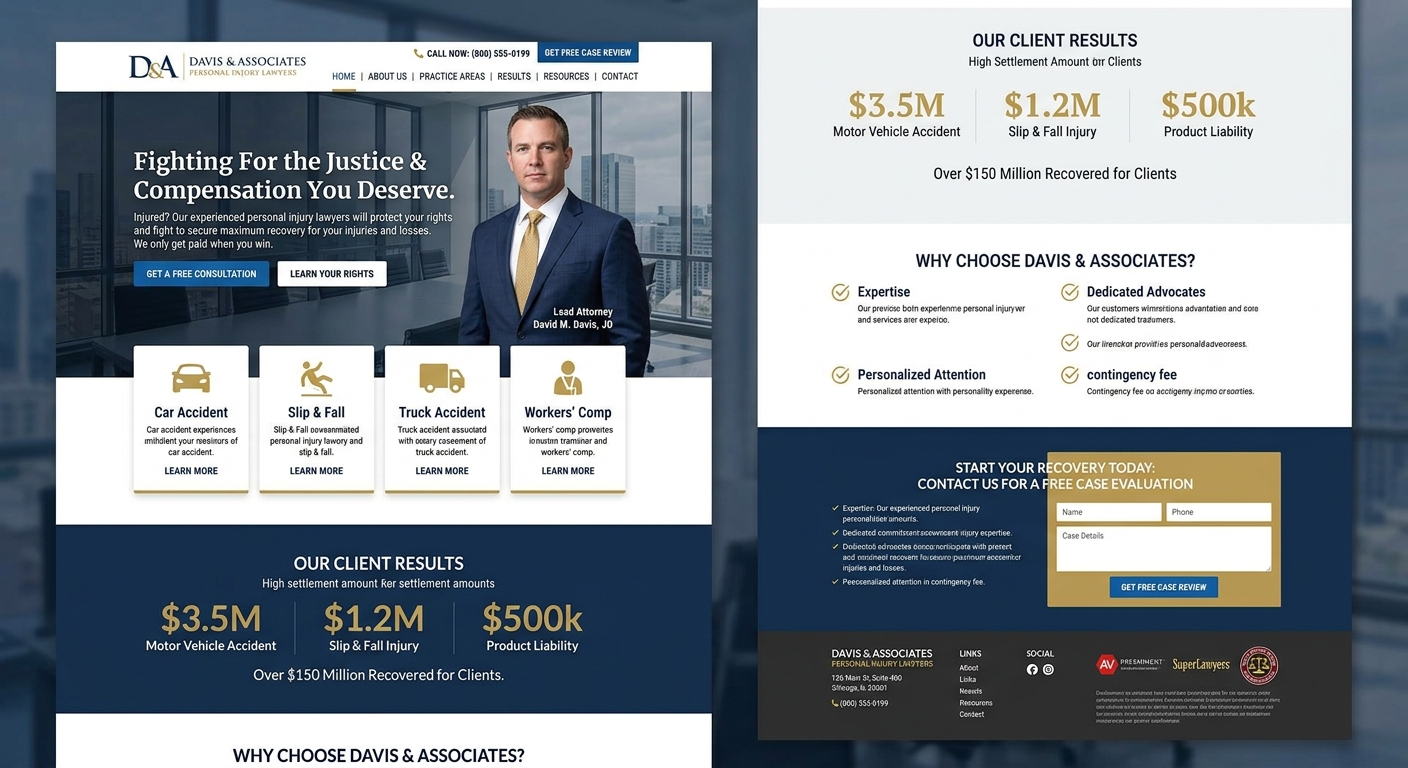
Results pages convert. A prospect with a herniated disc wants to see a herniated disc result, ideally in a venue they recognize. Give them case type, injury, county, and amount. Leave out client names.
Every state bar has a rule on this, and most require a disclaimer that prior results don’t guarantee a similar outcome. Some states require it on the same page, some in the same visual field as the number, some in a specific proximity. Check your state bar’s advertising rule and its required disclaimer language before you design the grid, because a disclaimer designed in from the start reads like part of the page, and one added by a paralegal three weeks after launch reads like a warning label.
Practical layout: a grid with the amount large, case type beneath it, one line of context. The disclaimer sits under the grid in readable type, not 9px gray. Regulators and prospects both notice 9px gray.
Make the form shorter than your intake team wants
Your intake coordinator will ask for date of loss, insurance carrier, police report number, and whether the client has treated. Each field is reasonable, and each one costs you submissions.
Four fields: name, phone, what happened, submit. Intake collects the rest on the callback, which they were going to do anyway, because nobody types their insurance carrier correctly on a phone with a cracked screen. If you want to know the size of the effect at your firm, run the short form for 30 days and compare completion counts against your current numbers rather than trusting an industry benchmark.
The related fix is on the other side of the form. A short form that sits in an inbox for six hours is worse than no form. Our law firm intake analysis walks through the response-time side of this.
Chat versus call
Live chat staffed by humans is worth it in PI. Smith.ai and similar services answer, qualify, and warm-transfer to your intake line, which is the outcome you want. An AI widget that collects an email and promises someone will be in touch is worse than nothing: the prospect thinks they’ve contacted you, stops looking, and hears nothing until Monday.
If you run chat, route to a phone call as fast as the conversation allows. If you can’t staff it, use an after-hours answering service and keep the site clean.
Mobile load time is a conversion setting
Check your own Google Analytics for the mobile share, but assume it’s most of your traffic. Your slowest visitors are the ones in a car, on a spotty connection, in pain.
The usual culprits: an autoplaying hero video, a carousel slider, three chat and tracking scripts loading before any content paints, and attorney headshots uploaded at 4000px wide. Pull the field data in PageSpeed Insights, not the lab score, and aim for Largest Contentful Paint under 2.5 seconds on mobile. Fixing the hero usually gets you most of the way there in an afternoon.
Spanish pages, in the right markets only
If 30% of your county speaks Spanish at home and your competitors don’t have Spanish pages, this is one of the highest-return things you can build. Check the Census data for your service area and then check your own call log for how many Spanish-language calls you already turn away.
Build real translated pages with their own URLs and hreflang tags. Do not install a Google Translate widget and call it a Spanish site. And route those pages to a phone number answered by someone who actually speaks Spanish, because a Spanish landing page that dumps a caller onto an English-only intake line spends money to create a bad experience. The same logic applies to your ad copy, which we get into in personal injury lawyer marketing.
How to tell whether the redesign worked
Decide this before launch, not after.
Pull a Search Console baseline for the 90 days before launch: clicks, impressions, and average position for your top 50 queries. After launch, compare the same 90-day window and watch for the classic redesign failure, which is a URL structure change with no 301 map. If your practice area pages moved and nothing redirects, rankings fall and everyone blames the design.
Install CallRail with source tracking and count calls over 60 seconds, not total calls. Total calls includes vendors and wrong numbers. Set form submissions as a GA4 conversion event and tie them back to the landing page. Then, and this is the part most firms skip, track signed cases by source in your CRM, whether that’s Filevine or Lawmatics, so you can see whether the new site brought in better cases or just more of them. The organic side of the picture takes longer to move, so give it two quarters before you judge it.
Want a second set of eyes on your site before you rebuild it
Most of the firms we talk to don’t need a redesign. They need four changes to the site they already have. If you’re about to spend real money on a new personal injury law firm website, send us the URL through our contact page and we’ll tell you which of the fixes above would move your numbers first. You can see how we work at The Lawyers’ Marketer, and our website marketing breakdown covers what happens after the site is live.