TL;DR
- A great law firm website design is the one that signs more cases per visitor than the firm next door. Design awards are a nice-to-have, not the scorecard.
- Most “best law firm website design” lists you find online are agency portfolios in disguise. This page is an honest editorial roundup, organized by category so the examples actually match your practice.
- Seven categories: cinematic and video-heavy, modern plaintiff firms, boutique and solo, AmLaw and enterprise, family law, criminal defense, and niche or single-issue practices.
- We build and audit law firm websites for a living. If you want a free look at how your current site stacks up, the link is at the bottom.
If you search for the best law firm websites, the first ten results are mostly agencies showing off their own portfolios. PaperStreet, Scorpion, OnTheMap, FirmPilot, Justia, Clio, MyCase. Every list features sites the publishing agency built. Some are great, some are not, and none of them are honest editorial picks.
We do build websites for law firms (more on that further down), but the firms below are not our clients. They’re examples we genuinely admire, drawn from across the industry, with notes on what each one does well and where most firms go wrong when they try to copy them. When we see law firm website design that we like, we make a note of it.
Feel free to use this page as a swipe file for your own law firm website design needs. Steal the structural ideas, not the screenshots. Your site needs to look like your firm, not somebody else’s.
What separates a great law firm website design from a pretty one
A law firm website has exactly two jobs: tell the right people who you are, and make it easy for them to hire you. That’s it. Everything else is decoration.
The sites we admire most do four things well:
- They show, within five seconds, what the firm does and who it does it for.
- They give the visitor enough proof (case results, attorney credentials, real photos) to feel safe making contact.
- They make the next step obvious. Call this number. Fill out this form. Schedule this consult.
- They load fast on a phone, because that’s where most of the traffic comes from.
The sites we think are overrated do the opposite. They open with a full-screen drone video of the courthouse, lock up the conversion path behind three clicks, and treat the homepage as a brand piece instead of a sales tool. Design juries love those sites. Clients quietly bounce.
With that out of the way, here are the firms worth looking at our picks.
Best Law Firm Websites 2026
Category 1: Cinematic and video-heavy
Video-led homepages have become the default in personal injury and high-stakes plaintiff work. Done well, they create instant trust and emotional resonance. Done badly, they slow your Core Web Vitals to a crawl and bury the conversion CTA below the fold. The firms below get it right.
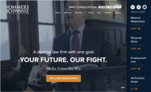
Sommers Schwartz (sommerspc.com): A billion-dollar Michigan plaintiff firm whose homepage opens with motion-driven video of actual attorneys, not stock footage. The site balances scale (over $1 billion in client recoveries) with approachability through warm photography and conversational copy. Worth studying for any firm that wants to feel both heavyweight and human.

Parris Law Firm (parrislawyers.com): A California PI firm whose site leans into cinematic team footage and a clear “We try cases” positioning. The video is short, captioned, and stops auto-looping after one cycle so it doesn’t drain the user’s battery.

West Coast Trial Lawyers (westcoasttriallawyers.com): The animated case-results counter on their homepage (a live-feeling ticker showing total client recoveries) is one of the most effective trust signals on any PI site. Steal the idea. Don’t fake the numbers.
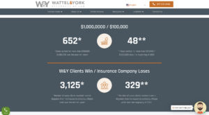
Wattel & York (wattelandyork.com): An Arizona PI firm that runs an interactive “Do you need help from a lawyer?” pop-up with an embedded video introduction. It’s pushier than we’d usually recommend, but it converts.
The takeaway: video is a trust accelerant, not a brand accessory. The video needs to feature your actual attorneys, run under 30 seconds, and never block the call button. If you’re a smaller firm without the budget for a full production, a single 20-second clip of the managing partner introducing the firm beats stock footage every time.
Thinking about adding video to your homepage but not sure if your site can handle the load times? That’s the kind of thing we look at in a free site audit.
Category 2: Modern plaintiff firms
This is the category that has evolved the fastest in the last three years. Plaintiff firms used to lean on billboard aesthetics and yelling-into-the-camera commercial copy. The best ones now look more like a tech startup than a law office, which is exactly why they’re winning intake from younger, more digitally native clients.
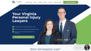
Osterbind Law (osterbindlaw.com): A Lynchburg, Virginia personal injury and disability firm that publishes more useful free content than most state bar associations. Their practice area pages double as plain-English guides, and the conversion path is straightforward. They’ve also been openly transparent about their case selection (less than 25 percent acceptance rate, which they actually say on the site). That kind of confidence is rare and it shows up in the design.
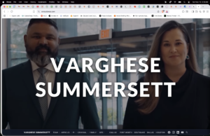
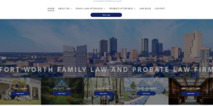
Varghese Summersett / Versus Texas (versustexas.com): A Fort Worth firm covering criminal defense, family law, and personal injury under one brand. Their site is the best example we know of in handling multi-practice navigation without confusing the visitor. Each practice area has its own visual identity inside a shared shell. They’ve also done a smart thing with their domain (versustexas.com) that doubles as a marketing message.
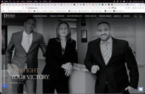
Dolman Law Group (dolmanlaw.com): Florida PI and mass tort. Their site does a great job of treating mass tort cases like distinct micro-sites within the larger brand. If you handle Camp Lejeune, talc, or other class-driven cases, this is the right structural model to copy.

Zaner Harden Law (zanerhardenlaw.com): A Denver PI firm whose site treats individual case results as the hero content rather than a buried “results” page. Their homepage carousel features specific verdicts and settlements with the practice area and a one-line story. That’s exactly how a personal injury visitor wants to evaluate you.
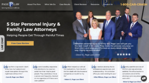
Page Law (pagelaw.com): Missouri and Illinois PI. Strong testimonial integration, clean visual hierarchy, and a phone number you cannot lose no matter how far you scroll. The “always-on” sticky CTA bar is a small detail that most firms get wrong by making it too aggressive or too easy to dismiss.
For more on the marketing strategy behind sites in this category, see our personal injury lawyer marketing breakdown.
Category 3: Boutique and solo practitioner sites
The biggest mistake solo and small-firm sites make is trying to look bigger than they are. A two-attorney boutique with a homepage that screams “national presence with offices coast to coast” is going to feel hollow the moment a real client calls. The boutique sites that work lean into being small.

Nanthaveth & Associates (austinimmigrationattorney.com): An Austin immigration solo with a site that does what most immigration firms forget. It addresses the visitor’s actual emotional state (fear, uncertainty, language barriers) before getting into qualifications. The site is also fully bilingual in a way that doesn’t feel like an afterthought.
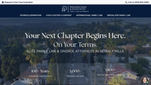
Provinziano & Associates (provinziano.com): An LA family law firm that built one of the most useful resource libraries in the practice area. The boutique-scale brand is intact, but the content library punches at AmLaw 200 weight.
Bob Leonard Law Group (bobleonard.com): A small Texas family and probate firm whose site nails the warm, approachable feel that family law buyers want. High-quality photography of the actual attorneys, no stock images of generic happy families.
The takeaway for solos: the goal is not to look big. It’s to look like the right fit. The right fit for a divorce client and the right fit for a startup founder are completely different vibes, and your design should reflect which one you actually are.
Category 4: Big law and enterprise
Big law websites operate under different constraints. The site isn’t really the conversion mechanism (relationship partners and referrals are), it’s a credibility check and a recruiting tool. The best big law sites understand that and don’t try to act like a personal injury intake funnel.

Latham & Watkins (lw.com): The reference standard for global firm sites. Clean, fast, and built around their thought-leadership content engine more than around practice area landing pages. The site assumes the visitor already knows what Latham does and is there to verify a specific attorney, deal, or insight.

Cooley (cooley.com): The site that other big firms quietly copy. Cooley positions itself as the firm for tech, life sciences, and venture-backed companies, and the homepage doesn’t pretend to be anything else. Worth studying for any firm that wants to be known for a specific market vertical rather than a practice area.

Kirkland & Ellis (kirkland.com): Heavy in the multimedia department, with strategic video integration that fits a firm at their revenue scale. For 99 percent of firms reading this page, copying Kirkland is the wrong move. But if you’re an enterprise firm trying to understand what “good” looks like at the top end, this is it.

Skadden (skadden.com): Strong video backgrounds tied to actual practice content, not vanity B-roll. The site does a great job of feeling premium without feeling stuffy.

Cravath, Swaine & Moore (cravath.com): Notable for what it doesn’t do. No motion video, no flashy hero, no aggressive CTAs. Cravath has historically operated as a closed-door referral firm and the site reflects that confidence. If your brand position is “if you don’t already know who we are, you’re not our client,” there’s a version of that worth aspiring to.
For midsize firms trying to position somewhere between boutique and enterprise, the lesson here is restraint. The site can be confident without being loud.
Category 5: Family law
Family law is the practice area where website voice matters more than design polish. The visitor is in emotional pain, often making the most important decision of their adult life, and they need to feel safe before they feel impressed.
Miami Family Law Group (miafamilylaw.com): Empathetic copy, real attorney photos, and a consultation booking flow that doesn’t make a divorce client feel like they’re shopping for car insurance.
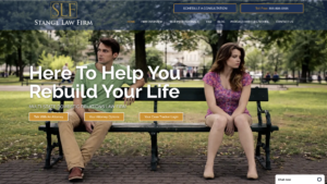
Stange Law Firm (stangelawfirm.com): A multi-state family law firm with one of the better resource libraries in the practice area. The site has clear practice area pages for every state they’re licensed in, which is rare execution at scale.
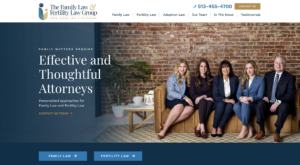
The Family Law & Fertility Law Group (familyandfertilitylaw.com): Niche family law with a fertility specialty. The site smartly separates the two practice tracks visually so a fertility client doesn’t feel like they wandered into a divorce mill.

Charles R. Ullman & Associates (charlesullman.com): A Raleigh family law firm with one of the better attorney biography pages we’ve seen. The bios feel like real introductions, not legal résumés.
If family law is your bread and butter, our family law marketing page covers the channel mix that pairs with a site like these.
Category 6: Criminal defense
Criminal defense websites have to do something most other practice areas don’t, which is reassure a visitor who may be scared, embarrassed, or actively in trouble with law enforcement. The best ones get the tone right.
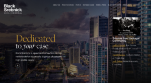
Black Srebnick (royblack.com): Roy Black is one of the most famous criminal defense attorneys in the country, and the site treats his personal brand as the asset it is. If you have a marquee attorney, this is the model to study.

Cody Warner, P.C. (codywarnercriminaldefense.com): A solo criminal defense site in Montana that punches well above its weight. Strong personal brand, clear practice scope, and the kind of trust signals (Avvo ratings, state bar credentials, case results) that a criminal defense visitor needs.

Hamideh Firm (hamidehfirm.com): A Texas criminal defense and family law firm with one of the cleanest mobile experiences in the practice area. Tap-to-call is everywhere it should be without feeling spammy.
The strategy mix for this practice area is covered in our criminal defense marketing breakdown.
Category 7: Niche, mass tort, and single-issue practices
Some of the most interesting law firm websites in 2026 aren’t trying to be “the firm for everything.” They pick one very specific lane and dominate it.
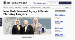
Pitta & Baione (pittabaione.com): A New York firm focused specifically on 9/11-related injury and illness claims under the Victim Compensation Fund and Zadroga Act. The site is laser-focused on that one client population, and the messaging treats first responders and their families with the appropriate weight.
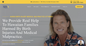
SRB Law (srbhawaiilaw.com): A Hawaii medical malpractice firm with a specific focus on birth injury and “early resolution” cases. Their narrow positioning is the entire point of the site.

Bick Law LLP (bicklawllp.com): An environmental defense firm with a sharp visual identity built around the specific subject matter. The design has fingerprints, in a good way.

Bursor & Fisher (bursor.com): Consumer class action and privacy litigation. The site reflects the plaintiff-side class action world (high-volume intake, technical sophistication, and a serious tone) without falling into the dated look that plagues most class action sites.

Gang & Associates (veteransdisabilityinfo.com): VA disability appeals, with a site structured around the specific stages of the VA claims process. This is the right way to structure a single-issue resource site.
The lesson from this category: a narrow site beats a broad site almost every time. If you do three things, your homepage should not list 17.
There is always room for improvement
The inside joke with web design companies is that websites are never “done.” There’s always something to add, improve or rework in order meet the new tastes of demands of law firm clients. With that said, here are a few things we think would improve the impressive list of websites above:
- Hero video that auto-plays with sound. Even the cinematic firms above keep it muted by default. Sound-on autoplay is one of the fastest ways to lose mobile visitors.
- Generic stock photography of “diverse business handshake.” Real attorney photography costs $1,500 to $3,000 for a half-day shoot. Spend the money.
- Mega menus with every practice area, every attorney, and every resource crammed into a single dropdown. If your top nav has more than seven items, you’re confusing people. Pick a hierarchy.
- AI chatbot pop-ups that demand contact info before answering a single question. A chatbot is one of the most powerful features you can add to your law firm website. It can be useful for things like screening visitors and after-hours intake, but the moment it acts like a paywall on basic info, conversion drops. Embrace chat bots as a good customer experience solution, but spend some time thinking through the default settings to make sure they reflect your level of customer service.
- “As featured in” logos with no link or context. If you’ve been quoted in Forbes, link to the actual article. Unlinked logos look like decoration and visitors have learned to distrust them.
How we approach law firm website design
When a firm comes to us for a new site or a redesign, we don’t start with templates and we don’t start with mockups. We start with three questions:
- What does the marketing channel mix look like? A site optimized for Google organic traffic looks different from one optimized for paid search landing pages, which looks different from one optimized for referral and direct visits. If we don’t know how people are going to find the site, we can’t design it.
- Who is the actual buyer, and what’s their emotional state when they arrive? A divorce client and a startup founder need completely different first impressions. The design has to match.
- What does the firm want to be known for in two years, not just today? A site that perfectly reflects your current practice mix will be outdated the moment you expand. We design for where you’re going.
From there, we handle the build, the copy, the photography direction, and the technical setup (page speed, schema markup, AI search readiness, conversion tracking). We don’t outsource anything to a generic web shop that builds plumber sites on Tuesday and law firm sites on Wednesday. Every site we build is for a law firm, which means we already know the bar advertising rules in your state, the conversion patterns in your practice area, and the technical SEO requirements that matter.
We also stay involved after launch. A site that signs cases in month one and stops working in month six isn’t a win. Our website work pairs naturally with our ongoing SEO and legal AI services, but you don’t have to take the rest. We’re happy to build the site, hand you the keys, and walk away if that’s the right fit.
How to actually use the examples above
Don’t pick one of these sites and tell your developer to copy it. That’s how you end up with a site that fits another firm’s positioning and not yours.
Instead, do this:
- Pick two or three firms from your category whose sites you genuinely admire. Open them on your phone.
- Write down the three specific elements from each that you want to learn from. Not “I like the colors.” Specific things, like “the sticky call button on mobile” or “the way they structure case results by practice area.”
- Bring that list to whoever is building your site. A specific list of six elements is far more useful to a designer than “I want it to look like Latham but for personal injury.”
If you’d like a second opinion on that list, or you want us to take it from there, reach out.
A note on what’s coming next in law firm website design
The biggest shift happening in law firm web design in 2026 isn’t about visuals, it’s about how AI search engines crawl, summarize, and cite legal content. The firms that will dominate the next three years are the ones building sites that get cited inside ChatGPT, Claude, Gemini, and Google’s AI Overviews, not just ranked on the blue-link results page.
That means structured FAQs, schema markup, clear authorship signals, and content that answers questions in the same shape an AI summary wants to deliver them. If you’re rebuilding your site this year and not thinking about how AI engines parse it, you’re already behind. More on that is on the Legal AI page.
Get a free audit of your law firm website design
If you’ve read this far, you’re either planning a redesign, frustrated with your current site, or both. We do free law firm website audits that look at how your site performs on the things that actually matter: page speed, mobile experience, conversion path, trust signals, and AI search visibility. No sales pitch, no canned PDF.
Reach out through the contact page and ask for a website audit. We’ll send back something specific and useful, whether or not you ever hire us.